Mobile Friendly Websites
Over the last few years mobile overtook desktop as the primary device people use to access the internet. Therefore to be successful it is essential to utilise mobile friendly websites to expose your brand and to drive high levels of traffic. We Are Web have worked with many companies to create and implement reliable, engaging and successful mobile friendly websites.
How Do We Create a Mobile Friendly Website?
If you partner up with We Are Web the following are some of our expert strategies to create an implement an effective and successful Mobile Friendly Website to enhance your marketing reach.
Don’t make a separate mobile friendly website
A mobile friendly website should be an extension of your existing desktop website. We will help you to create a website that complements your existing website. This will ensure your website shows up on Google’s search engines optimally.
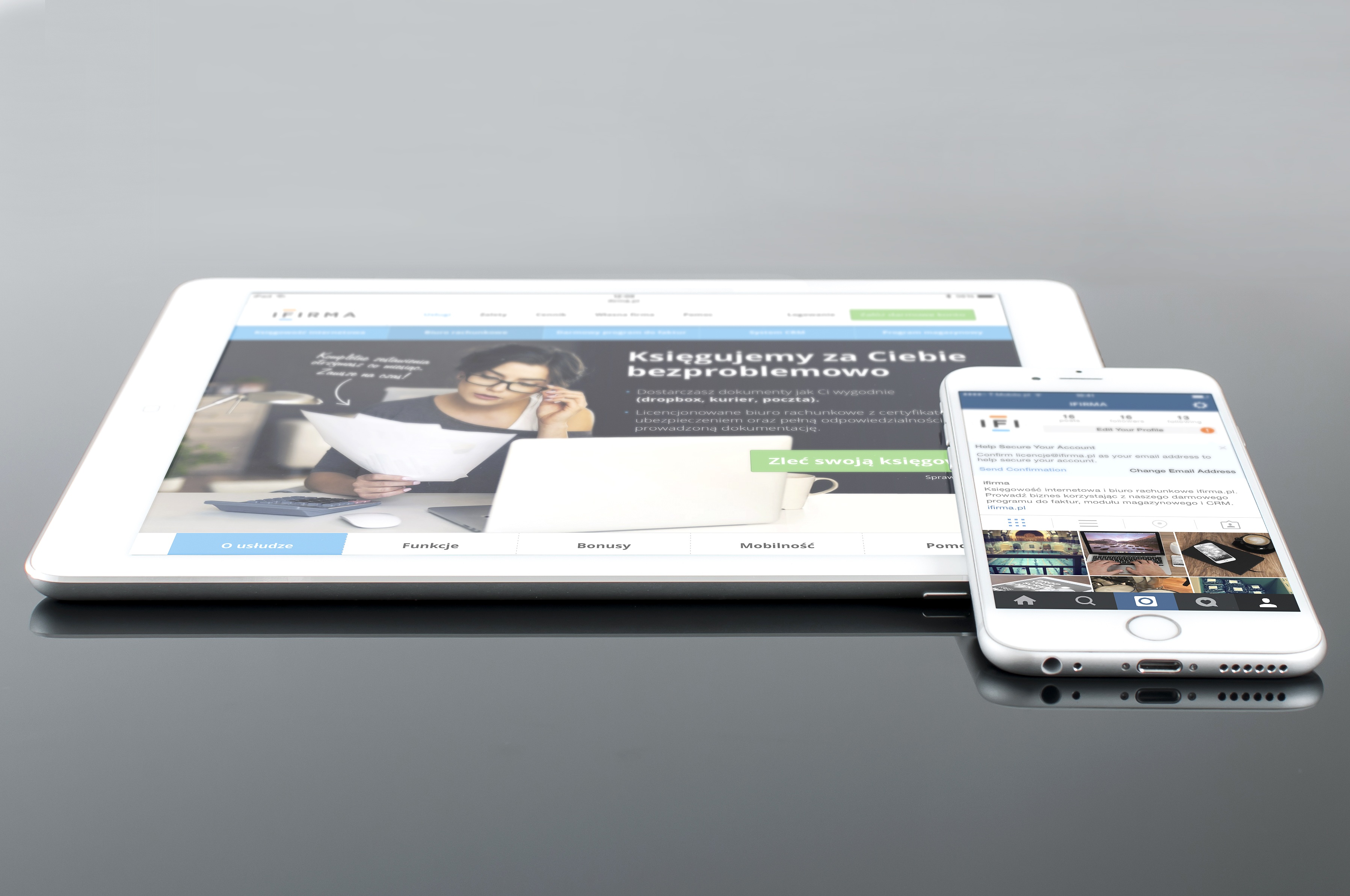
The design needs to be responsive
Our design of your website will be responsive which allows the website to easily display and be viewable on different sizes of devices. The will maximise the time spent on creating the website. It will also allow the use of flexible layouts, images and cascading stylesheets. Furthermore, a responsive design will mean the webpage will be able to effectively detect your visitor’s mobile device screen size and orientation and adjust the layout accordingly.
Utilise a viewpoint meta tag
This is very important as the viewpoint allows the browser to determine how content is scaled and sized. When building a multi-device experience, you want your site to work effortlessly on any mobile device, and the viewpoint meta tag will tell your visitors browser to make sure the page and content fits the screen.
Suitable font sizes and button sizes are key
This matter a lot when viewing webpages on a mobile device. We know what size works best so the experience for your customers is easy and enjoyable.
Use high-resolution images
High resolution images are a must to ensure the mobile experience is of a high standard and visually eye catching.
Use YouTube Videos
Videos are a wonderful way to engage your audience with your products and services. As YouTube videos embed code is already responsive so it will be easily integrated onto your webpage and easily viewed on any mobile device.
Link the users mobile experience to your desktop website
It is always a good idea at the bottom of your mobile site to include ‘go to full website’ or view desktop version’. It not only links your desktop website, it also gives your potential new customer another option as they may prefer to experience the full site as well.
Contact Us Now!
If you need one of the best mobile friendly websites on the market that will provide an alternative to your desktop website, call (03) 86091078.